Coined by UX designer Harry Brignull in 2010, UX dark patterns are deceptive UI/UX elements and tricks that nudge users towards unintended actions, often benefiting the company at the expense of the user’s autonomy and well-being. These patterns exploit our cognitive biases, emotional vulnerabilities, and limited attention spans to steer us toward decisions we wouldn’t have made otherwise.
The allure of dark patterns for companies is undeniable. They can dramatically increase conversion rates, boost revenue, and lock users into unwanted subscriptions or services. In the short term, it’s a win-win: companies see profits soar, and users… well, they might not realize they’ve been played until it’s too late.
Let’s shine a light on some of the most common dark patterns:
1. Bait and Switch
Luring users with attractive initial offers, only to switch them to inferior or more expensive options during checkout. Think “free trial” buttons that morph into paid subscriptions after a hidden trial period.
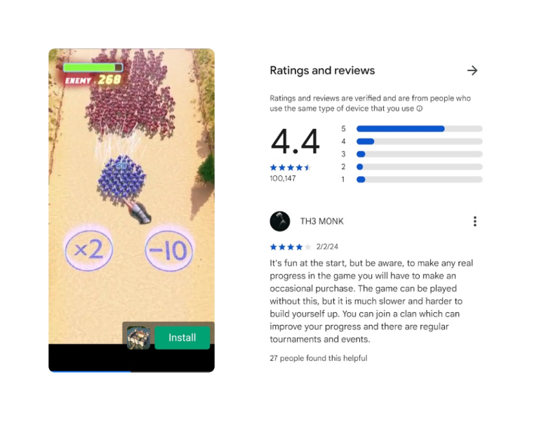
Many freemium mobile games advertise “free” downloads but lock essential features behind paywalls. Deceptive ads showcasing unlocked gameplay vs. in-app purchase screens highlighting locked features.
2. Forced Continuity
Making it near impossible for users to cancel subscriptions or memberships, burying cancellation options in convoluted menus or requiring multiple phone calls. Think of subscription services that hide the “unsubscribe” button behind layers of menus and confirmation prompts.
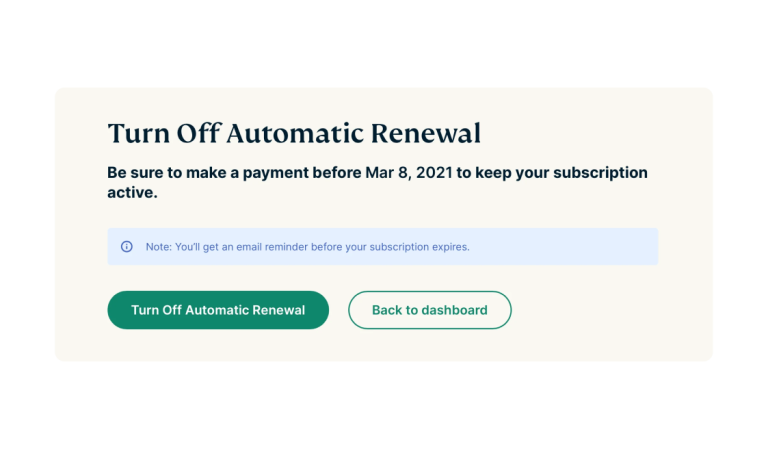
Some websites that are subscription-based hide the cancellation flow under a new name: “auto-renew” or “edit plan.” For Express VPN and Vimeo, there isn’t a button or area that says “cancel.” The user has to look for “auto-renew” and turn off “auto-renew” payments to cancel the subscription. This kind of naming adds confusion and friction to the cancellation process.
Source: The Pudding
The Roach Motel Maze approach can also be classified under forced continuity. You’ve finally subscribed to that streaming service for the must-watch show everyone’s talking about. But when you try to cancel after binging the season, you find yourself trapped in a labyrinth of confusing menus, hidden buttons, and misleading wording. This is the roach motel tactic. Companies make it easy to sign up but nearly impossible to unsubscribe, banking on our inertia and reluctance to navigate complex cancellation processes.
3. Price Comparison Prevention
Obfuscating or manipulating price comparisons to make their product or service seem like the better deal. Think of websites that hide competitor prices or use misleading visual cues to influence price perception.
Source: Passport Photo
Airlines might display fares without taxes and fees, making them seem cheaper than competitor options that include all costs upfront. Other industries, such as restaurants are also known for adding taxes to the final bill and not show them in the menu when ordering.
4. Friend Spam
Tricking users into granting access to their contact lists and then spamming their friends with unsolicited messages or invitations. Remember those annoying Facebook quizzes that asked you to tag all your friends?
While the likes of “bait and switch” and “forced continuity” are widely recognized, a subtler breed of dark patterns has emerged, lurking in the shadows of seemingly innocent interfaces. Let’s shed light on these lesser-known manipulators and empower ourselves to navigate the digital world with informed skepticism.
5. Social Proof Puppets
Imagine browsing a restaurant review website, eager to discover the perfect dining spot. You stumble upon a seemingly glowing review, complete with a picture of a smiling couple enjoying a delectable meal. But upon closer inspection, you realize the picture is a stock photo, and the reviewer’s profile suspiciously lacks other reviews. This, my friends, is the insidious trick of fake social proof. Companies leverage our tendency to trust the opinions of others by creating fabricated testimonials, inflated review scores, and even ghost accounts to sway our decisions.

This article by David Teodorescu discusses in detail how social proof evolved into dark pattern that takes advantages of biases.
6. The Decoy Dilemma
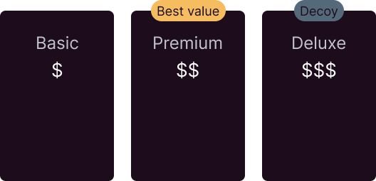
Picture this: you’re shopping for a new pair of sneakers. Two options stand out: a basic pair for $50 and a premium pair with all the bells and whistles for $80. You’re tempted by the premium features, but the price tag gives you pause. Then, suddenly, a third option appears: a “deluxe” version with even more features for $120. Now, the $80 premium pair suddenly seems like a bargain! This is the decoy effect in action. By introducing an overpriced, undesirable option, companies make their target price point appear more attractive and justifiable.
6. Progress Pressure
Ever felt a pang of anxiety as a progress bar creeps closer to completion, urging you to finish a task before time runs out? This is the scarcity trap. Limited-time offers, countdown timers, and progress bars create a sense of urgency and scarcity, pushing us to make impulsive decisions we might otherwise avoid. Think flash sales that disappear in minutes or loyalty programs that expire soon. Companies leverage our fear of missing out to influence our behavior and encourage hasty purchases.

This article outlines some strategies used to create urgency and scarcity.
6. The Confetti Conundrum 🎉
Imagine completing a tedious online survey, finally reaching the end, only to be bombarded with confetti explosions, celebratory music, and congratulatory messages. While seemingly harmless, this excessive positive reinforcement can manipulate our emotional state. The celebratory atmosphere creates a sense of accomplishment and satisfaction, making us more likely to overlook any negative aspects of the experience, such as privacy concerns or manipulative design elements.
9. The Guilt Trip Guiltline
Picture donating to a worthy cause online. As you fill out the donation form, a progress bar tracks your contribution alongside others, subtly highlighting those who have donated larger amounts. This is the guilt trip guiltline in action. Companies leverage our empathy and social comparison to pressure us into giving more than we initially intended. Public displays of donation amounts can make us feel obligated to conform to perceived social norms, potentially leading to over-contribution due to a sense of guilt or inadequacy.
10. The Nudge Theory Ninja
Imagine browsing a news website and encountering an article with a “related articles” section. Each article title is carefully crafted to pique your curiosity, often using clickbait-y language or sensational headlines. This is the nudge theory in action. Companies subtly influence our attention and choices by strategically positioning information and utilizing cognitive biases. The “related articles” section, while seemingly helpful, is often designed to keep you hooked on the website, consuming more content and generating ad revenue.
11. The Privacy Paradox Puzzle
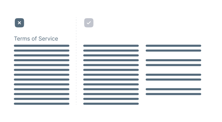
We all value our privacy online, yet we readily click “accept” on lengthy Terms of Service agreements without a second glance. This is the privacy paradox. Companies create the illusion of user control with extensive privacy settings and consent pop-ups, but the sheer volume and complexity of these options often lead to passive acceptance, even if we disagree with the data collection practices.
12. The Frictionless Funnel
Imagine signing up for a free trial with the intention of canceling before your credit card gets charged. But as you navigate the seemingly user-friendly cancellation process, you encounter a series of hurdles: endless confirmation prompts, hidden cancellation buttons, and even phone calls to customer service representatives who make the process intentionally cumbersome. This is the frictionless funnel paradox. Companies design seemingly frictionless signup processes that lure users in, but the cancellation path is deliberately riddled with obstacles to discourage churn and maximize profits.
13. The Personalization Puppet Master
Ever notice how certain websites and apps seem to know exactly what you want before you even know it? This is the power of hyper-personalization. Companies leverage sophisticated algorithms and vast stores of user data to tailor the user experience, creating a sense of familiarity and trust. However, this personalized web can be a double-edged sword. While it offers convenience and targeted recommendations, it can also manipulate our preferences and choices, subtly nudging us towards decisions aligned with the company’s goals rather than our own.
These less common dark patterns, although subtle, are no less insidious. They exploit our cognitive biases, emotional vulnerabilities, and desire for efficiency to influence our behavior and decisions. By understanding these manipulative tactics, we can become more vigilant digital citizens, navigating the online world with a healthy dose of skepticism. We can demand transparency from companies, advocate for ethical design practices, and empower ourselves to make informed choices that align with our values and needs.
Ian Wright from Merchant Machine had the following findings:
- Amazon had 11 dark patterns, making it the worst.
- Dell and HP each had three dark patterns, and were found to be the worst online retailers.
- Instacart had five dark patterns, and was found to be the worst grocery retailer.
- On average, beauty retailers used the most dark patterns (3.6) on their website.

The subscription option in Amazon is selected by default, and the other option is greyed out to put primary focus on the recurring purchase.
Dr. Mark Leiser, Dr. Cristiana Santos and Kosha Doshi reported the following on their website Deceptive Patterns.
The use of deceptive patterns in online practices has drawn increasing scrutiny and legal action, resulting in significant financial penalties for companies found to be engaging in such practices. Several high-profile cases have been settled with multi-million dollar fines, highlighting the potential consequences for violating consumer protection laws.
- Epic Games paid $245 million to settle charges that they were using deceptive patterns in Fornite’s payment system.
- Diet app Noom paid $62 million to settle charges that they were using deceptive patterns in their subscription and auto-renewal practices.
- AT&T paid $105 million to settle charges that they were adding unauthorised fees for services onto customers’ phone bills, without their knowledge or consent.
